House of Love
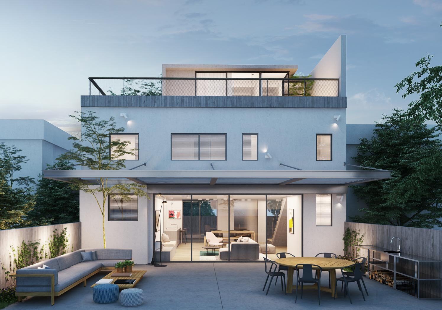
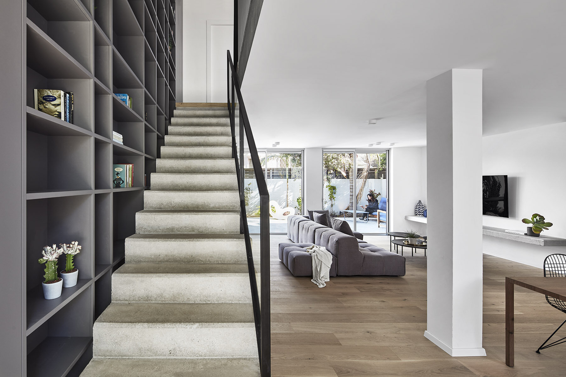
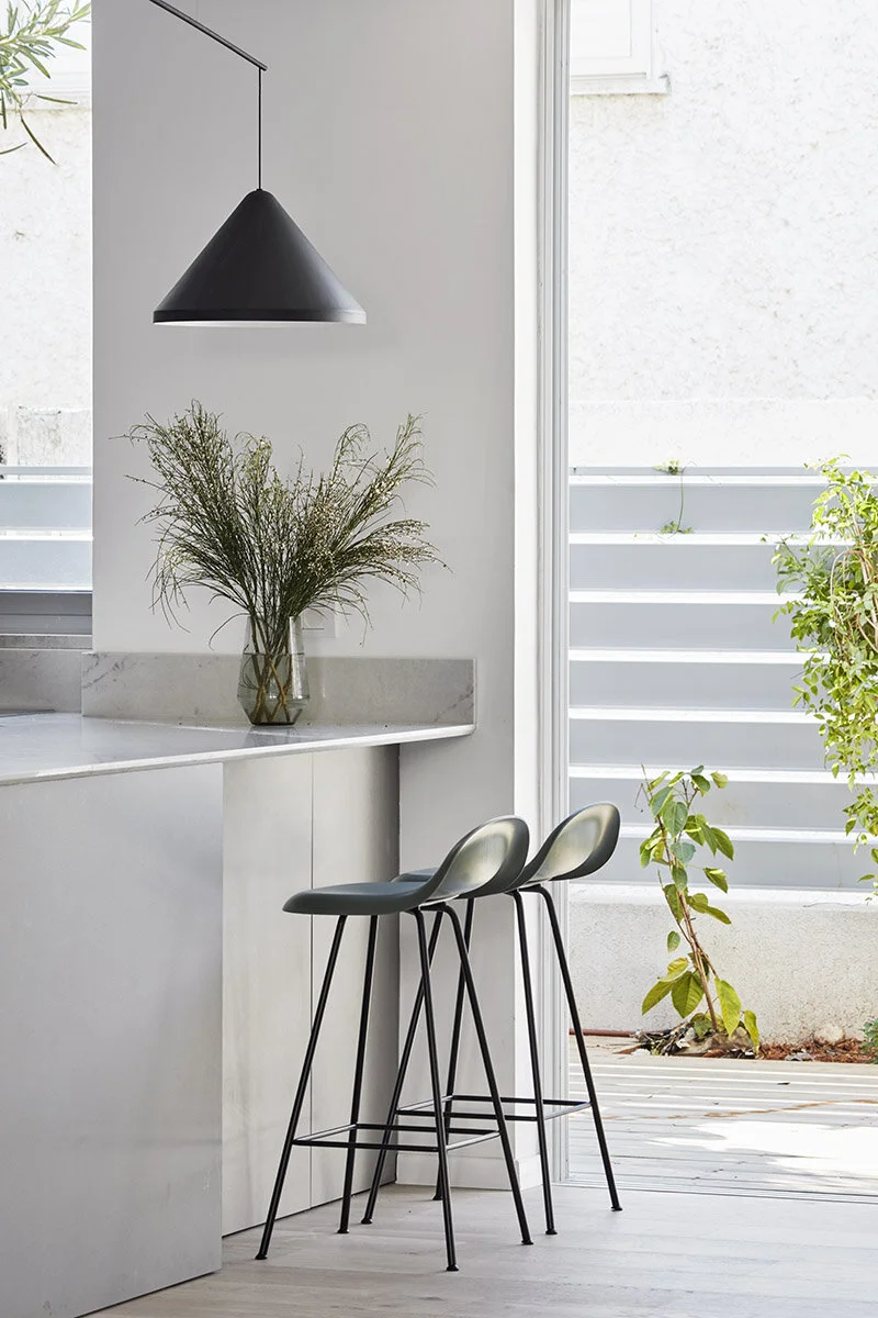
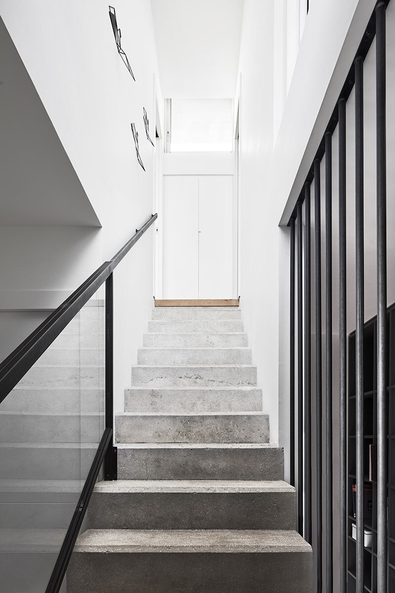
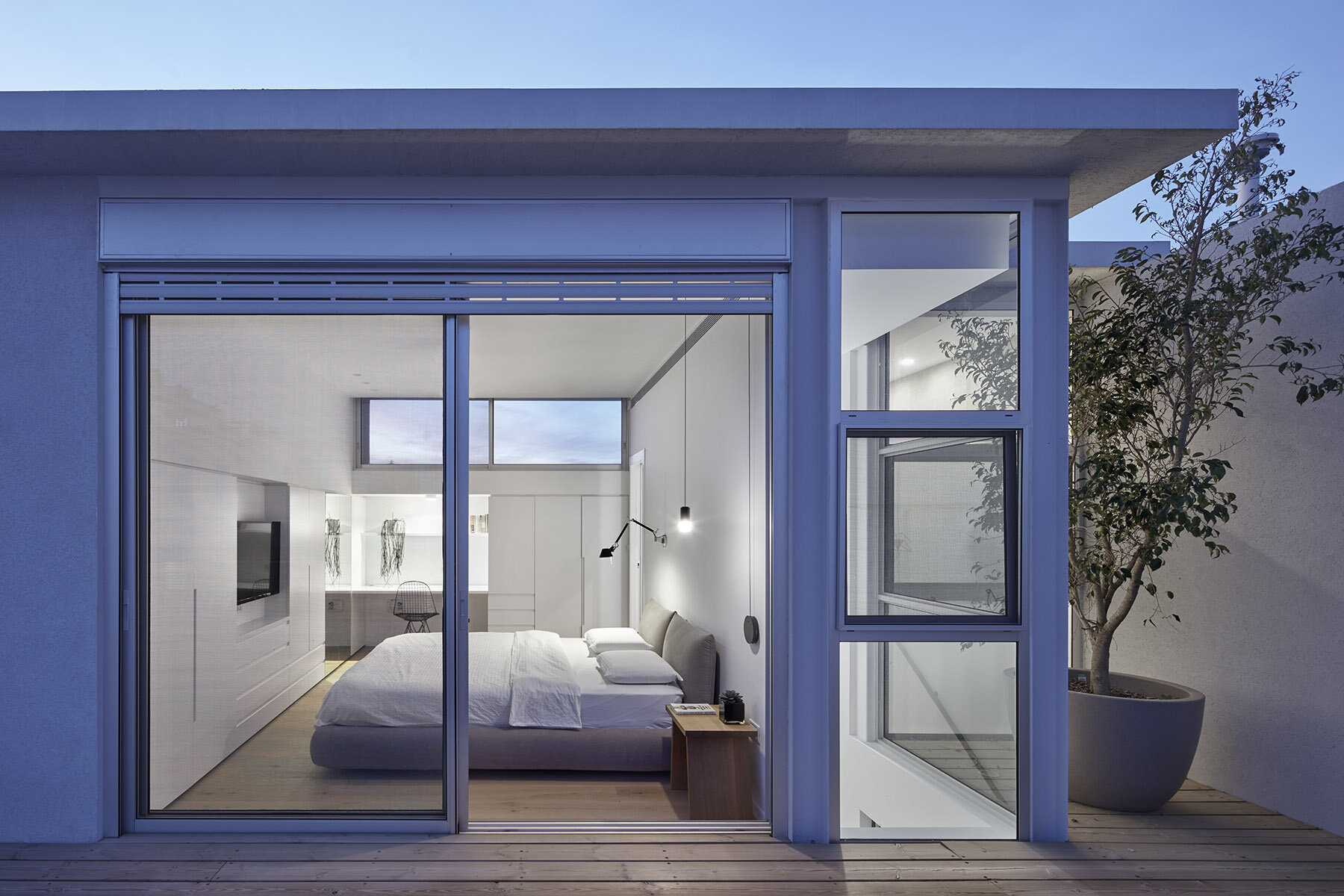
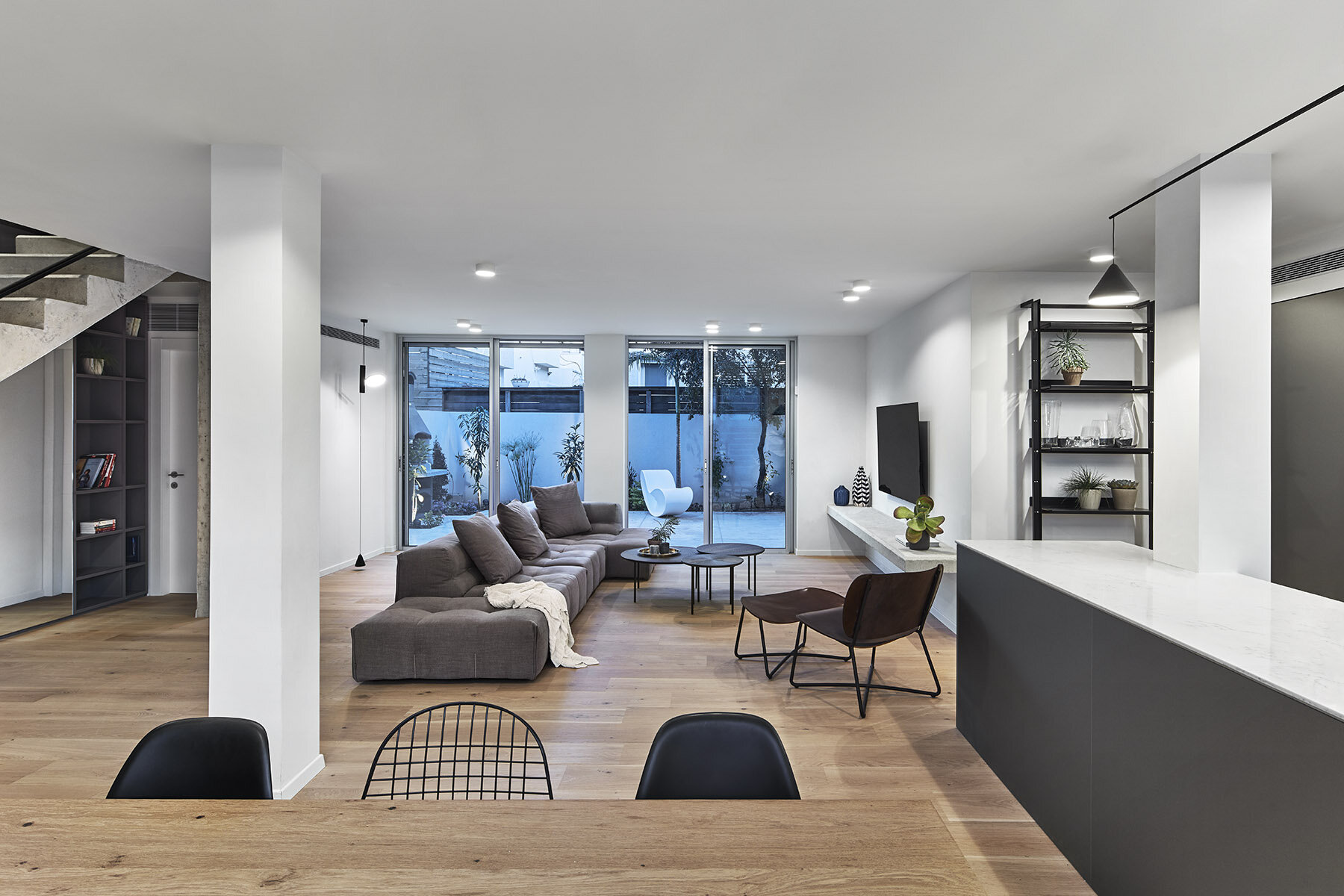
We were asked to renovate an old house built in the 1970s. The project comprised several challenging features and required a thorough renovation, including a substantial construction addition that involved expanding the upstairs floor space and adding a new rooftop level—all within a limited budget.Read More...The house is part of a row housing complex consisting of four attached homes with shared walls—almost like a box caged on all sides, desperately seeking light and space. We wanted to alleviate the suffocating feeling and provide a sense of spaciousness and height. Our goal was to create spaces that are fluid, open, well-lit, and ventilated, despite the relatively low ceiling height (2.5 m.) and the particular location of the home. The design plan we developed was geared at accommodating the needs of a family of seven, including two adults and their five children. The family determined and expressed their specific needs, emphasizing that the house should include a spacious library to contain their professional literature collection, as well as the many other books in their collection. The first step in engineering the space was to open as many floor-to-ceiling entrances as possible, to both the front and back gardens. We replaced the original staircase—which included three narrow turns—with an airy staircase, made from exposed poured concrete and detached from the wall on one side by a few centimeters. There, we built an expansive library stretching from the ground floor up to the ceiling of the upstairs level. The library is constructed from colored MDF plates and includes a variety of functional elements, including electrical and communication panels, drawers for storing shoes and games, a mirrored-door coat closet, and a drinks bar. The grid shelving continues along the length of the staircase, changing its rhythm based on the allotted length and width. These two main elements—the staircase and library—stand parallel to one other and lend the desired sense of spaciousness and height. The entrance floor includes the dining room, living room, and kitchen, as well as sliding glass doors that open up to the back garden, significantly expanding the living room space throughout most of the year. The tall kitchen cabinets stretch along the length of the wall and contain more than a few functional elements, including ample space for storing kitchen utensils and electrical appliances, a central air-conditioning unit, and a door leading to the back pantry. This door doubles as a decoy, hiding the entrance to the shelter room and operational areas of the home. The kitchen also includes a low worktop that serves as a leisurely sitting counter. The upstairs floor is designated for the children's rooms, all equally sized units. As part of the construction addition, we planned a small enclave of light and air at the end of the hall. In this section, open to the sky and bordering the neighboring building on one side, we planted a tree, giving life at the end of the corridor. The rooftop level is dedicated almost entirely to the master suite, a private unit separate from the rest of the house. It is a modest suite, utilizing every centimeter in the space. We designed an additional space (1.80 m.) around the suite, designated for storage units and a small home office. This additional space was not calculated in the reduced construction percentage allotted for the addition, granting us extra space on the rooftop level to provide more than an adequate storage solution. In summary, we succeeded in freeing the caged box that we received at the beginning of the process and created an expansive, well-lit space within the original meter limitations. We not only met the family’s needs but also exceeded their expectations in creating a minimalistic home without unnecessary ornamental features. From the outset of planning, we intended to ensure that our clients would not need to spend their time obsessively cleaning and maintaining order. We wanted to allow the pace of their daily life to interact with each detail in the space. We chose materials that will develop a graced patina over time, telling the family’s story in their home. It was important for us that the house and its various components age with grace and improve like a fine wine with each passing year.
Read Less
Year: 2019
Location: Ramat Hasharon
Photography: Studio Shai Gil
Publications: Dwell, Archilovers, Archello Interior Minimalistas Fineshmaker, Architizer
Vision.Concept.Process
